[Porter Airlines // Toronto, ON // Brand identity design]
The mission:
From the humble beginnings as “The Little Airline That Could” to one of North America’s premier boutique travel companies, Porter Airlines is a fantastic Canadian success story.
Porter chose to go the route (pun intended) of using a lowercase rounded typeface for their wordmark logo. It’s simple, safe and easy to transfer to most applications. However, dare we say, is it too simple for a rising airline?
The challenges:
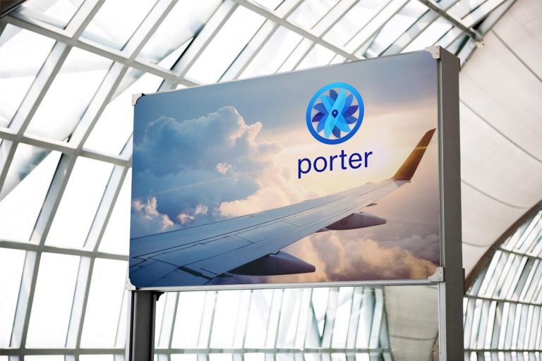
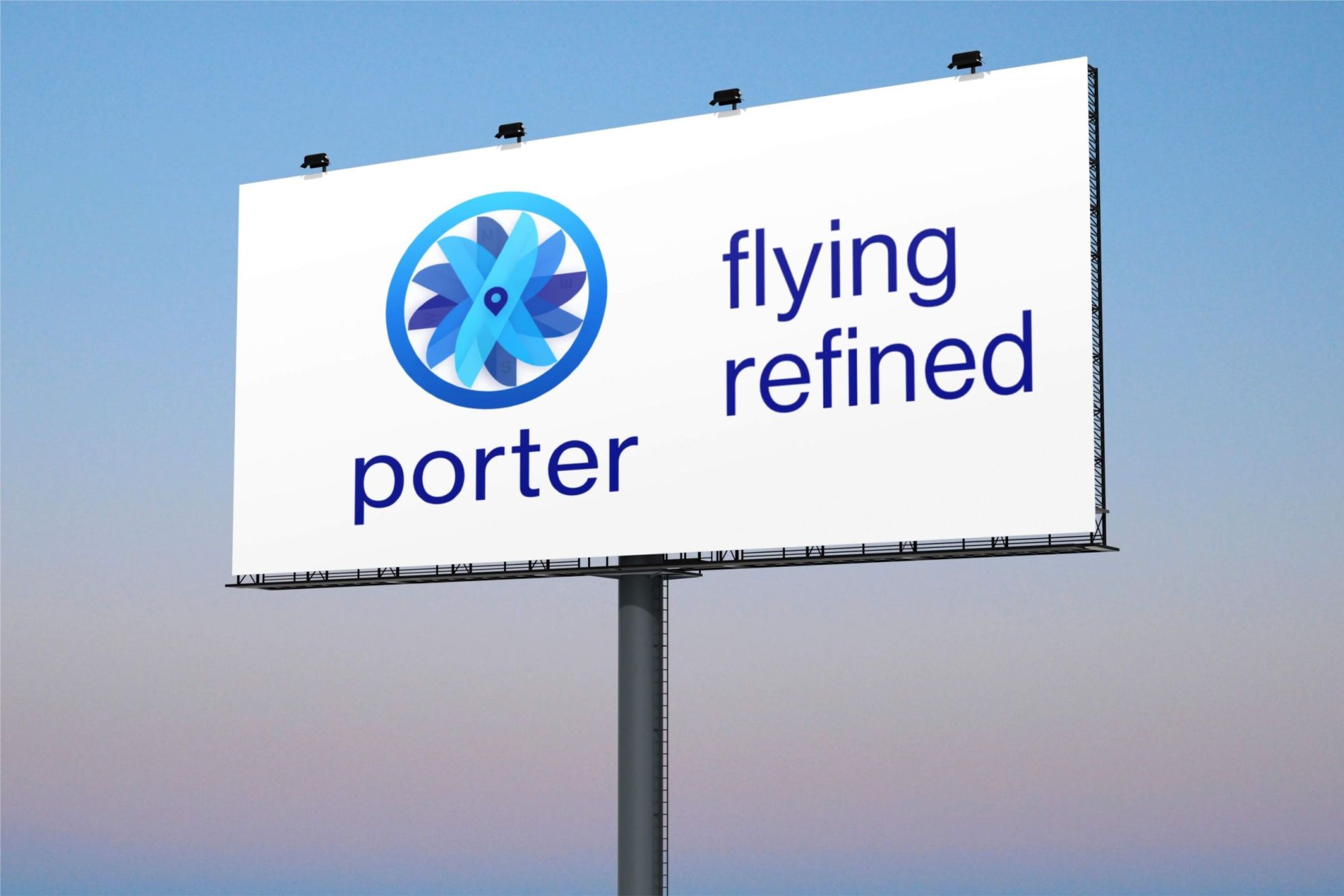
When I decided on a new logo for Porter, it made total sense to use aviation symbolism because it’s very singular in purpose. The original wordmark was also perfect to combine with a new logo, so you don’t need to fix what isn’t completely broken, right?
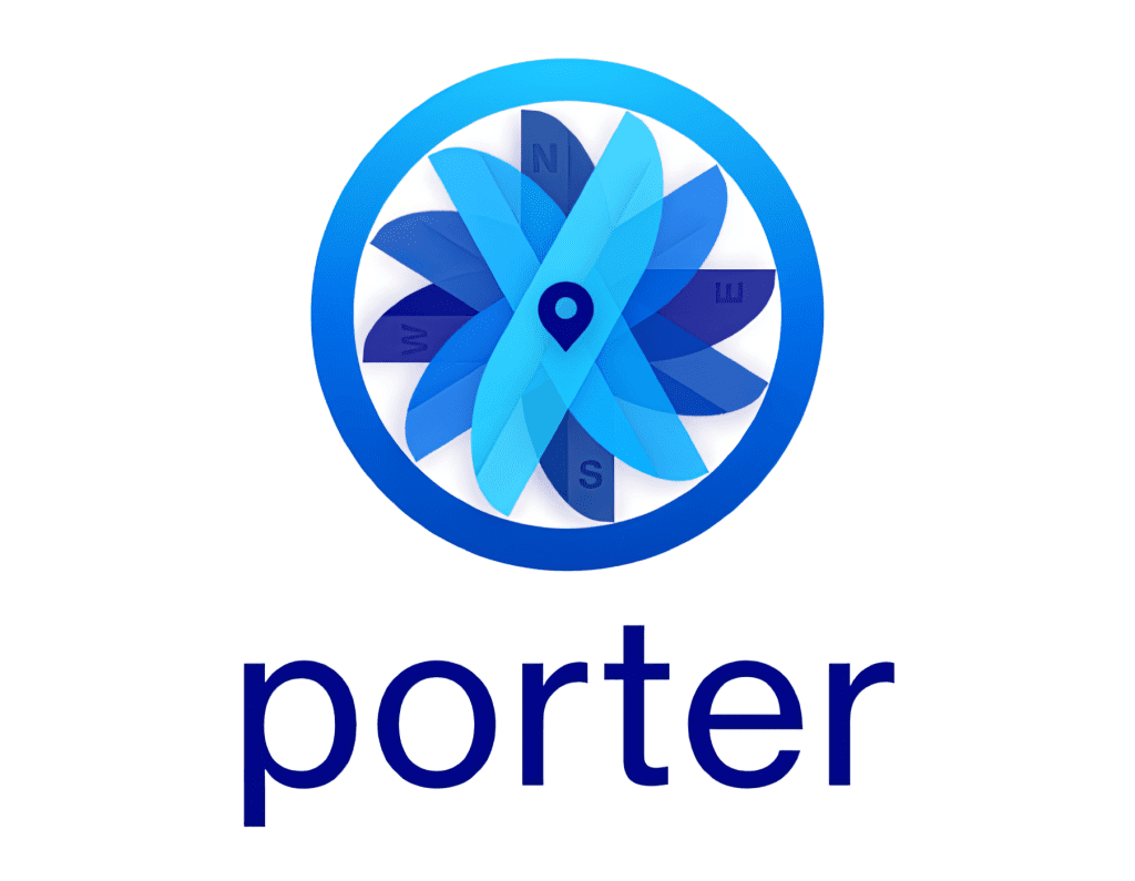
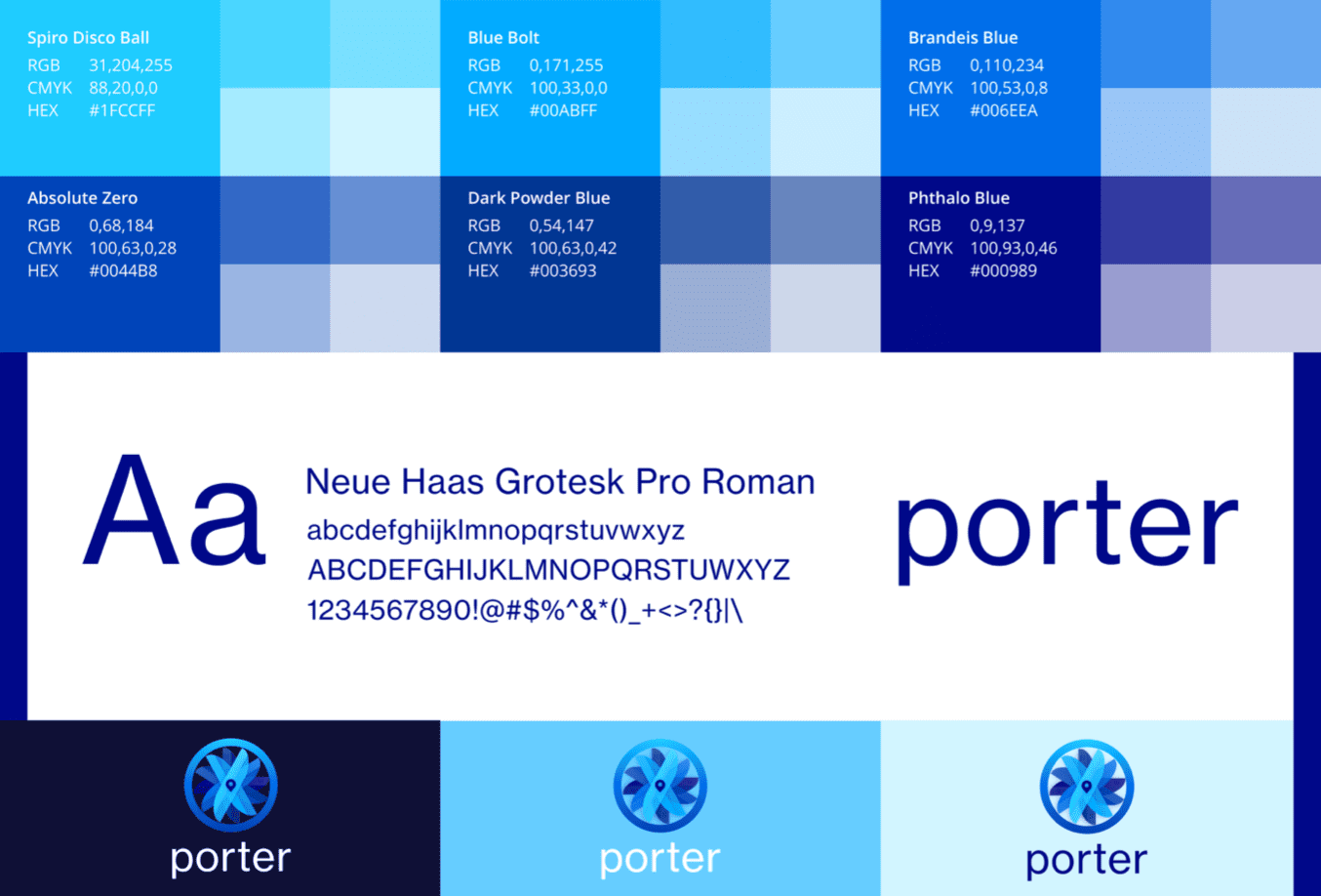
The inspiration for the Porter logo comes from Da Vinci’s Perpetual Motion drawings and theories. Porter also has a large fleet of the De Havilland (now Bombardier) Canada Dash 8 aircraft which, you guessed, has six propellers on it. I kept the logo simple blending in different shades of blue (representing the blue skies in which Porter flies) for the propellers while adding a N/S/E/W symbol on the propellers as a makeshift compass. I changed the rounded typeface and replaced it with a stronger gothic serif (Neue Haas Grotesk Roman) but kept it lowercase because it works.
The solution:
The result is an almost-3D logo which adds some much-needed colour, texture and aeronautical symbolism to the Porter brand. The look is exciting, classy and, above all, brings Porter into a new era of flying in style.