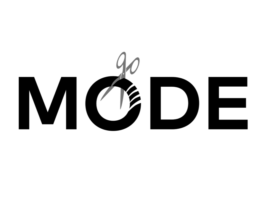
[MODE // Toronto, ON // Brand identity design]
The mission:
Mode is a small but mighty men’s hair salon in Toronto. Its actual full business name is MODE Hair Studio for Men but that can be a handful when it comes to sleek logo and branding. Their service and reputation are impeccable, so they needed something to capture their excellence.
Hair salons, much like dental offices or car mechanics, are usually one-trick ponies when it comes to how you can brand them. There’s only so much you can do to brand a place that cuts/styles hair, so the tricky part is to make branding that’s somewhat original yet intriguing.
The challenges:
Mode had used a very simple approach to their branding when they first started out. They went with black and white sans serif lettering with a pair of vertical scissors. Sometimes in rebranding, the original logo is leaned on for the redo and, in this case, I did just that. I didn’t stray very far from the original in my approach to a new logo. I matched up the typeface Mark Pro with a pair of scissors cutting into the letter O. Very simple and very much a hair salon logo without being a cliche.
The solution:
The result is a sleek, modern logo which isn’t a stereotype so much as its visual statement. Mode certainly didn’t need their branding reinvented, just a makeover, and it certainly represents their style.


