[The Senator // Toronto, ON // Brand identity design]
The mission:
If restaurants could earn titles for how important they were deemed by their customers, The Senator would truly be king. Originally built as a home in the 1850s, it turned into a restaurant in 1929 (then known as the Busy Bee) and then changed owners and renamed The Senator in 1948. This iconic diner/meeting place is the epitome of retro style and flair, where time seems to either slow down (or turn back) when you’re there.
The challenges:
How do you rebrand a classic like The Senator without paying homage to its storied past and while having it comfortably stay in a nice retro era in terms of style? Walking into The Senator doesn’t beg “let’s modernize everything” as opposed to “let’s keep this exactly how it is” and that’s how I approached this project. Keep it simple, classic and honourable.
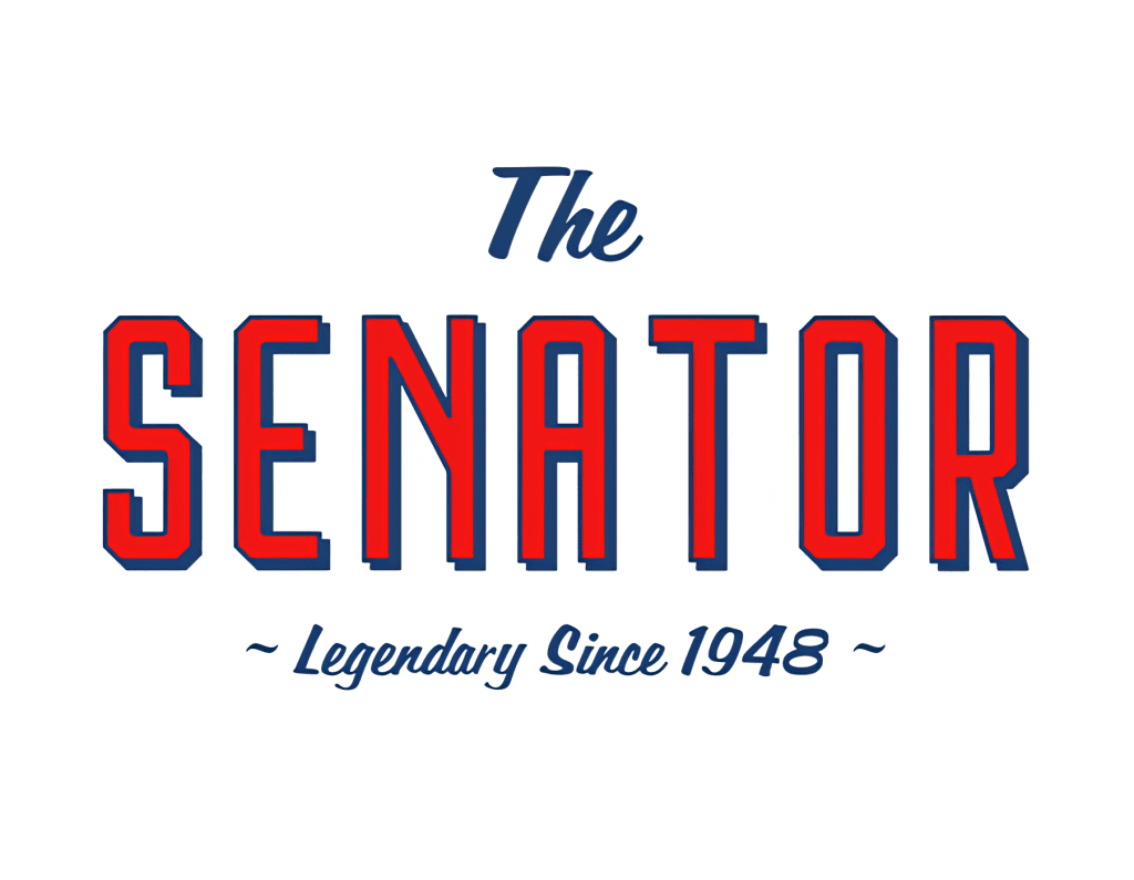
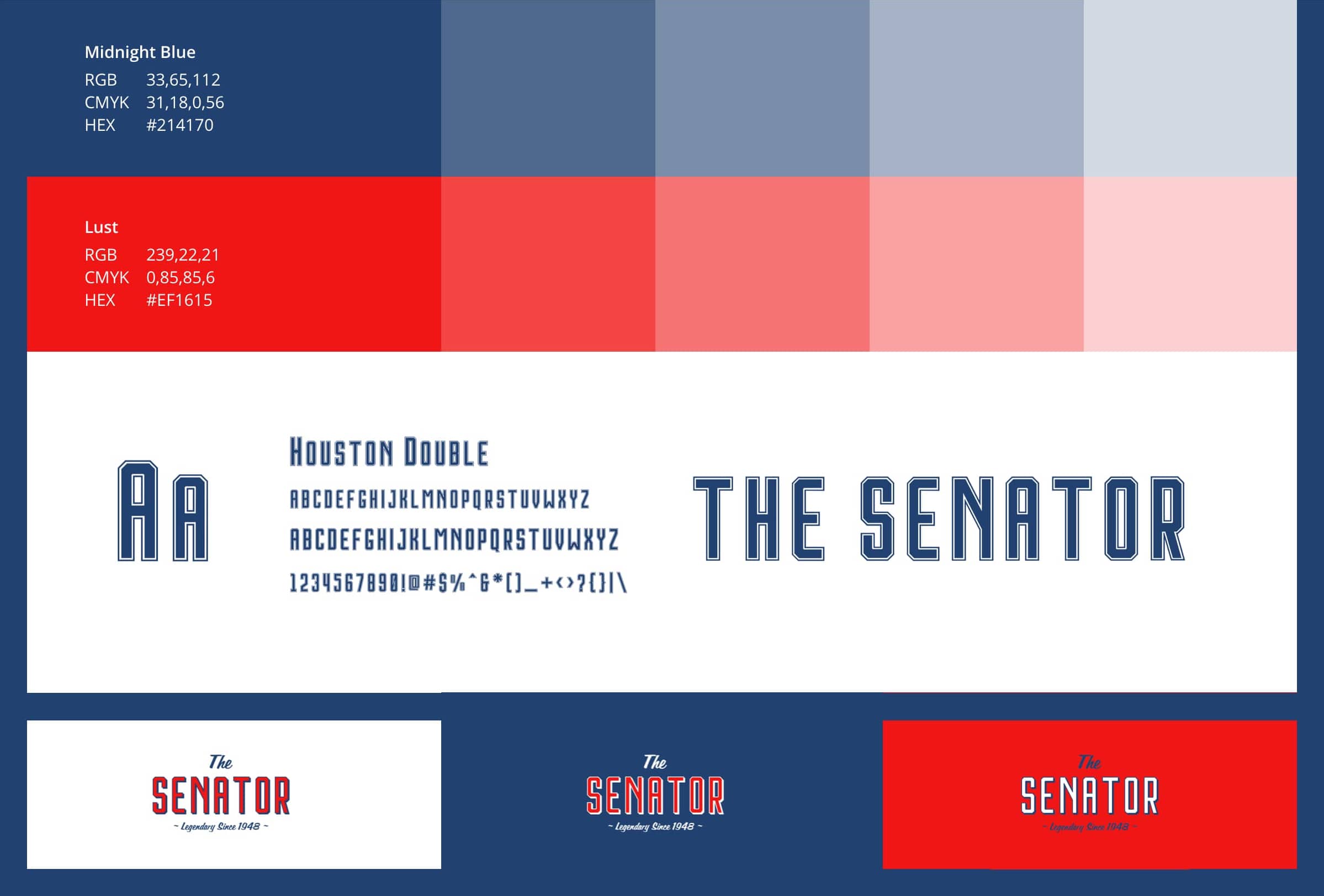
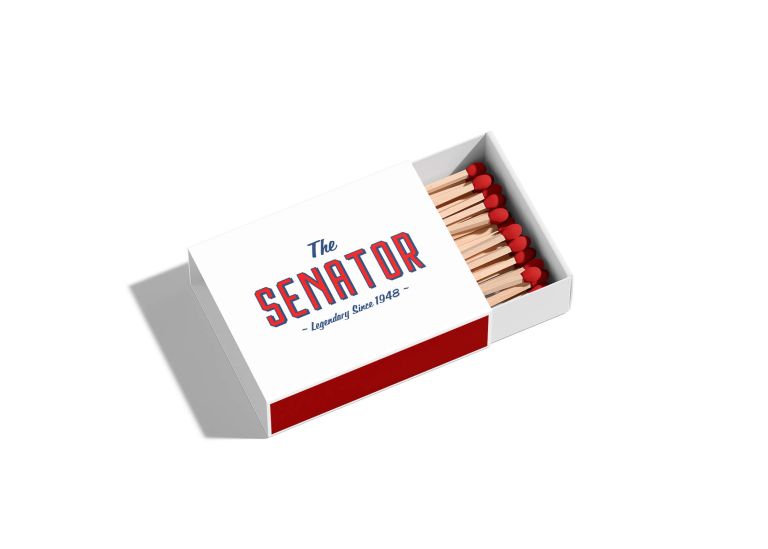
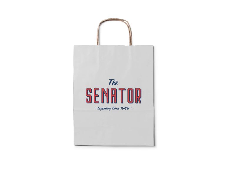
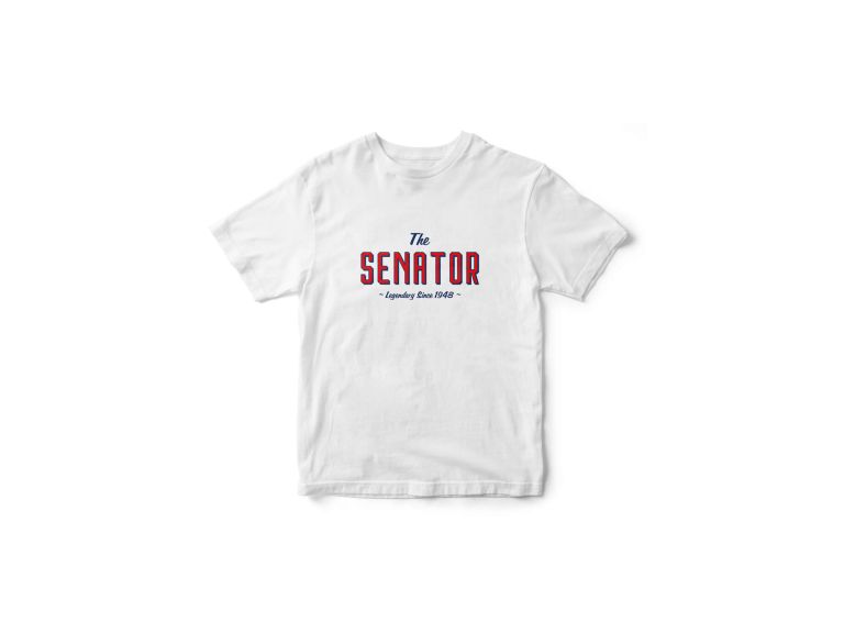
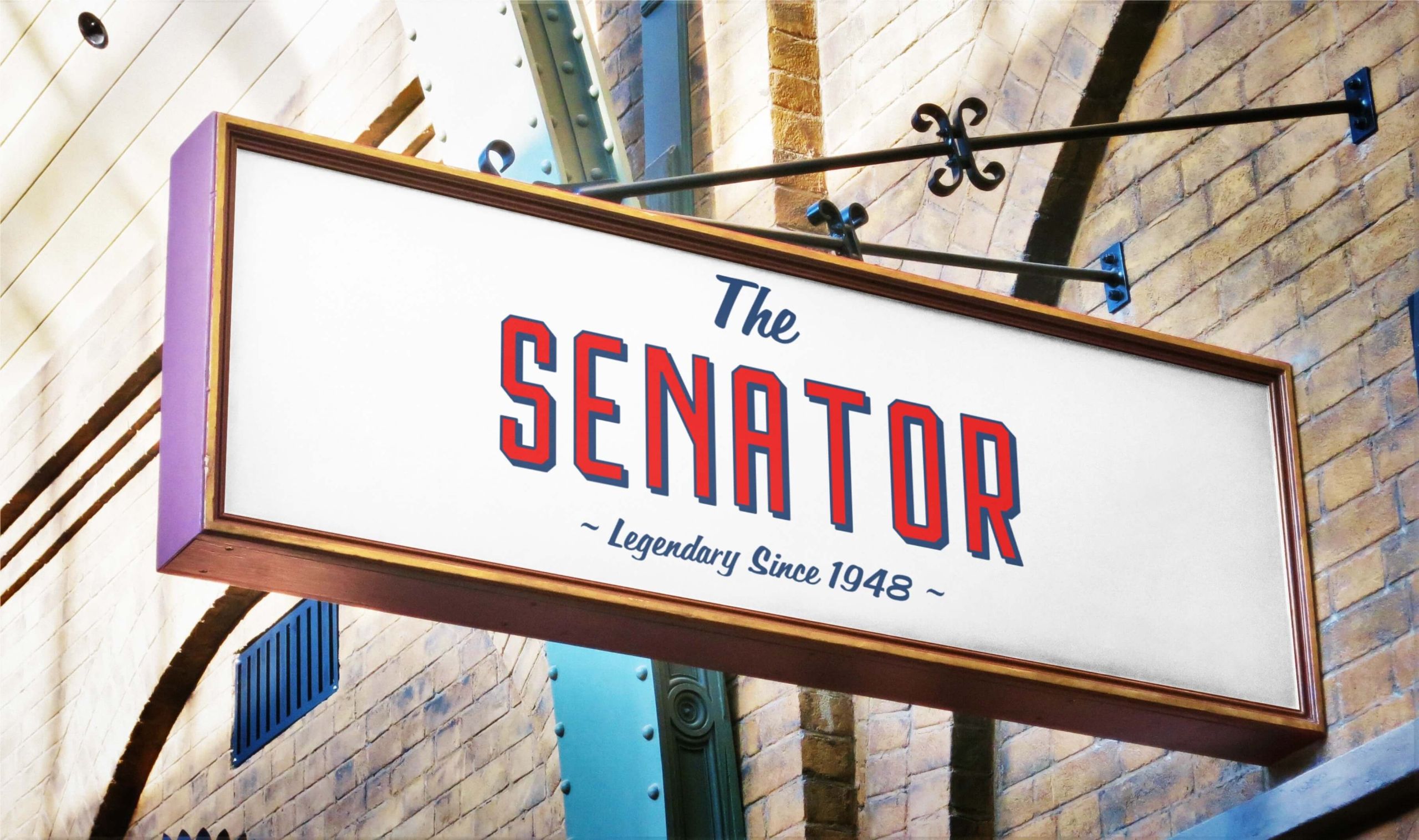
The typeface Houston, which is minimalist with sharp corners, was paired with Filmotype Lakeside, a typeface based on a retro sign painter brush script. I kept the tones a simple red and blue, not too bold but certainly colourful. I then added in the words “Legendary Since 1948” because, well, that’s exactly what The Senator is to Toronto and visitors from around the world.
The solution:
The result is a nice clean logo which doesn’t try too hard to be retro in its approach but certainly pays homage to The Senator’s deep roots in Toronto’s restaurant scene. It’s fun, can be applied to any backdrop and, just like The Senator, it’s simple without ever being confused for boring.