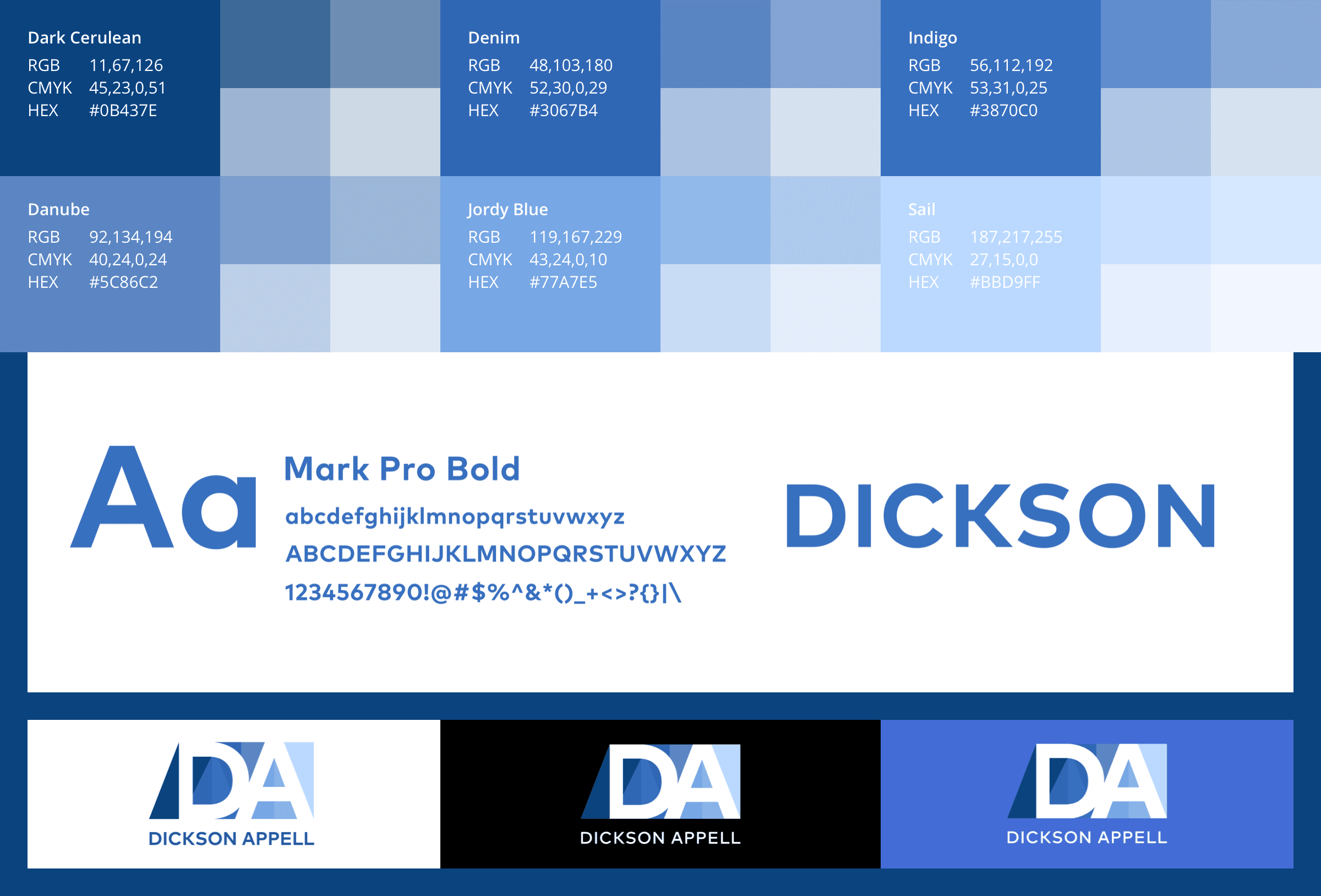
[Dickson Appell // Toronto, ON // Brand identity design]
The mission:
Pantry is one of those restaurants where their approach is so unconventionally different, you wonder why no one has done it before. It started out as a small takeout place in a thriving Toronto neighbourhood and, over time, evolved into something much more significant in the food industry. Three solid retail locations (and one catering locale) later and Pantry is now firmly established as one of the city’s most sought after places to get incredible fresh food at very reasonable prices.
The challenges:
Pantry, unlike their food, chose a wordmark logo for their budding business which is a bit bland for such a progressive restaurant. While there’s nothing wrong with a simple and basic approach, their logo definitely needed a makeover. Part of the challenge was designing a logo that’s sleek & sophisticated but not excessive. Having eaten at Pantry before, their style is a minimalist approach, and new branding had to reflect that narrative.
The solution:
When looking at a new design for Pantry, it wasn’t hard to look at kitchen symbolism and not get tons of inspiration. A new logo consists of two cupboard doors opening (or are they closing?) with the word “PANTRY” spanning across the middle in a sharp serif typeface (Novocento DemiBold). I really do like sharp serif typefaces a lot and, in this case, it made a lot of sense. Novocento compliments the doors but also symbolizes a knife’s blade, a countertop and even a take-out box.