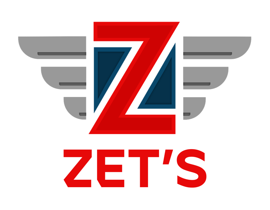
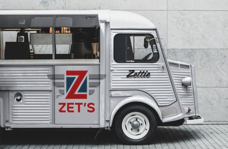
[Zet's Restaurant // Toronto, ON // Brand identity design]
The mission:
The Town of Cobourg is a great place to live, so let’s get that out of the way first and foremost. It’s a lovely town (population 20,500+ as of 2021) nestled on the shores of Lake Ontario, approximately 1.25 hours from Toronto. It’s an interesting mixture of classic old-town architecture, new suburbs and strip malls. Cobourg is surrounded by a ton of nature, which offers a lot of colour, recreation opportunities and space. Perhaps in the next five years or so if there’s still a mass exodus of people leaving Toronto, the town should start looking at incorporating itself as a city, but that’s a discussion for another day.
The challenges:
How do you guide a thriving and bustling town into a new and exciting chapter in terms of branding? Simply put: You give it a total modern makeover. The current logo/branding for the Town of Cobourg is, well, pretty dated. It’s not unattractive but it’s glaringly stuck in the past. The one huge issue with their current logo is the fact it can’t be properly transferred to various background colours due to its wide negative space design. I won’t knock the typeface (Goudy Old Style Bold) but, in this case, it’s dated and tired looking. While not hating on seagulls, you don’t really want your town to feature them on your branding, they aren’t exactly kind to humans and cars. Sadly, if your town is all about feeling good, the current logo certainly does nothing to convey this.
Cobourg is known as “Ontario’s Feel Good Town”, so I started with this first. Want your town’s image to look and feel good? You start with colours and lots of them. I used a palette which symbolizes what Cobourg is all about: The beautiful sunrise and sunset skies, the gorgeous hints of blue, teal and aqua in the water, the freshness of the landscape, nature and food which encapsulates this town so succinctly. I used a simple custom C as the basis of the logo and incorporated a destination marker as the focal point (since Cobourg is a huge tourist destination). I also reworded their slogan to “The Feel Good Town” because why should it be limited to just Ontario? The wordmark typeface was replaced with Isidora Alt Bold, which is a modern and expressive geometric font. The playful curves of Isidora mimic the waves which roll onto the sandy beach on those warm, Summer nights.
The solution:
The result is a very modern, rich and welcoming logo which is perfect for any background or application. It’s full of life and it’s opening proverbial doors/adventures to everyone. The colours are bold and the wordmark is simple. The tired and non-expressive current logo simply faded over time. Cobourg has changed, it’s not a sleepy little town anymore, it’s on the rise and a new logo & branding reflect this in many ways.