[The Buttermilk Cafe // Cobourg, ON // Brand identity design]
The mission:
An off-the-grid esthetician who needed branding but still wanted to stay off-the-grid. This was an interesting challenge to say the least. How do you brand for someone who stays under the radar?
Rita is successful, very good at what she does (beauty esthetics for women & men) and doesn’t mind being labelled “a small fish in a big pond” when it comes to her presence in her particular industry. She’s also very humble, so personal branding is hard for her to navigate through seeing herself as the product.
The challenges:
When I asked Rita what she wanted for a personal logo and branding, her response was “make it beautiful”. Simple enough, right? She likes the colour pink, likes flowers, and has a lovely soul. Considering she had almost zero branding when I met her, anything was almost better than nothing (in some regards). So I set out to make her something beautiful.
The solution:
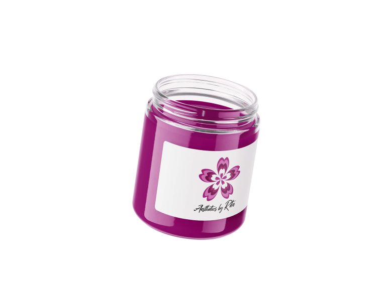
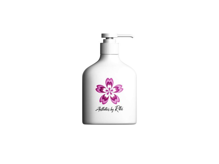
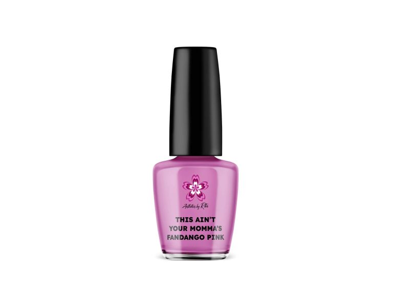
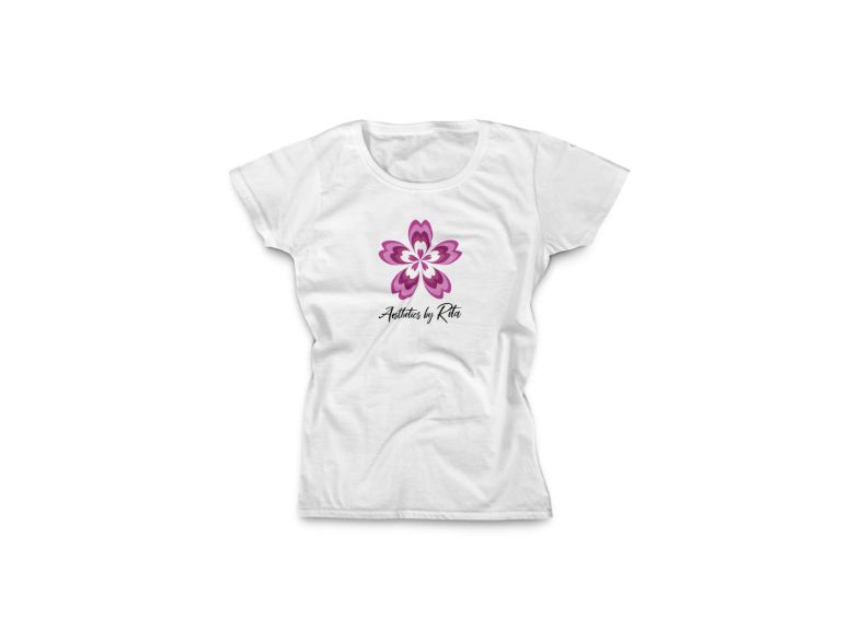
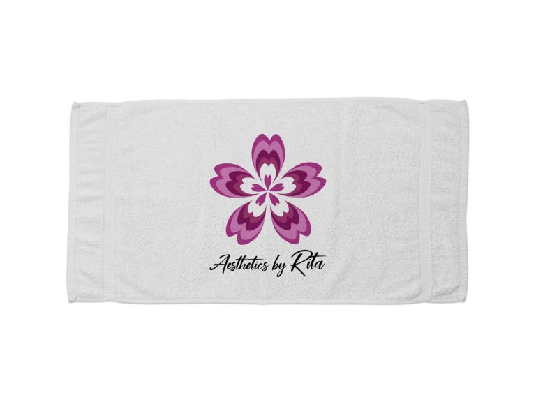
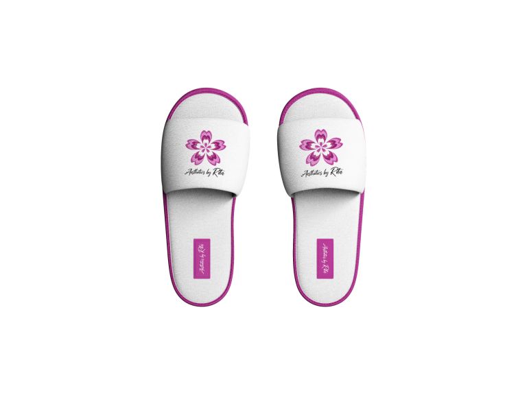
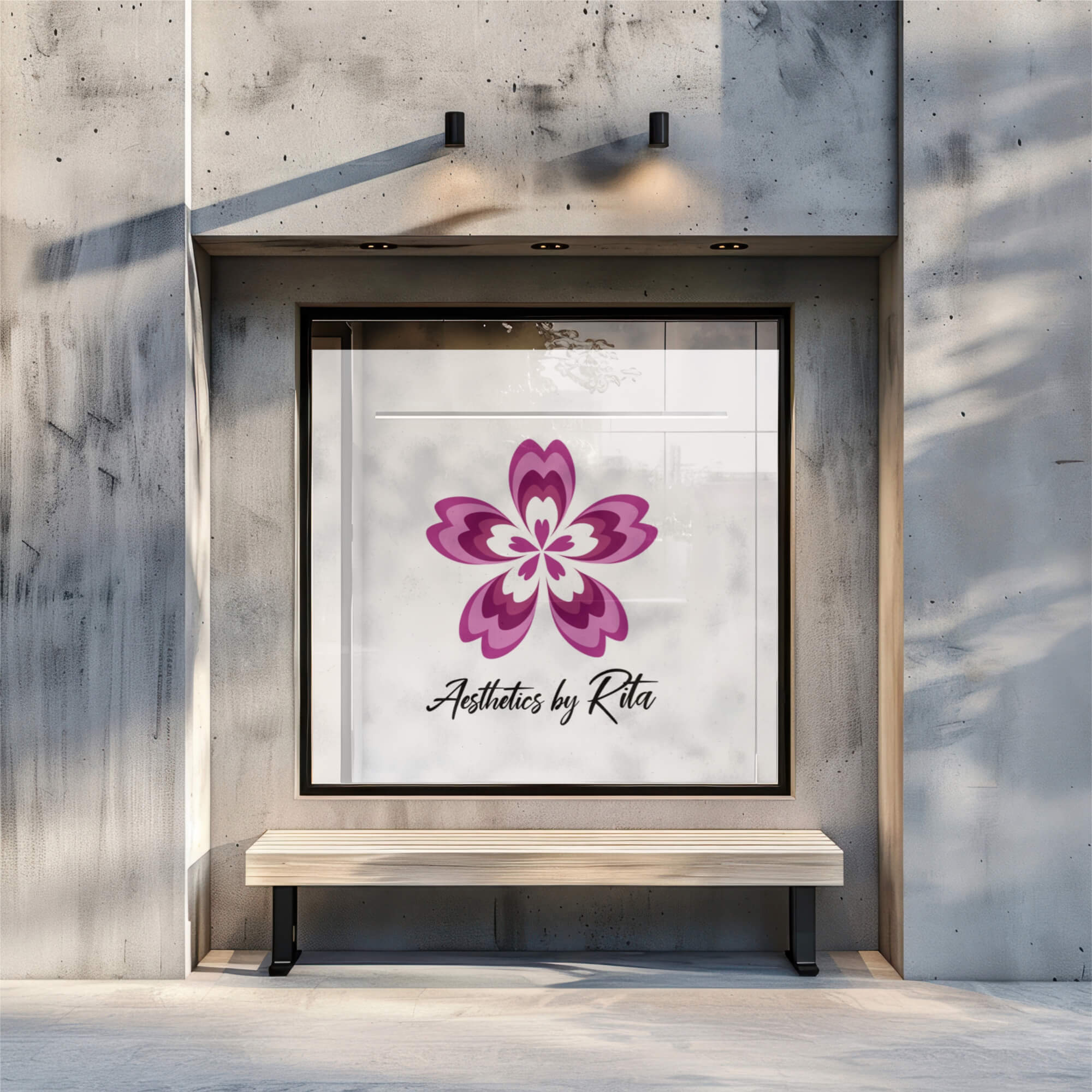
The inspiration for Rita was exactly what she conveyed to me: Pink, flower(y) and beautiful. I designed a flower (made up of hearts) in hues of pink and kept the lettering simple but sophisticated. I purposely kept the hearts asymmetrical because the human body is rarely perfect, no matter what we think (and there’s absolutely nothing wrong with that).
The result is a beautiful, bold and colourful logo and branding that not only conveys Rita’s outlook on life but also a sense of wellbeing & style. She’s still off-the-grid in terms of her work but now has strong branding to represent her great work.