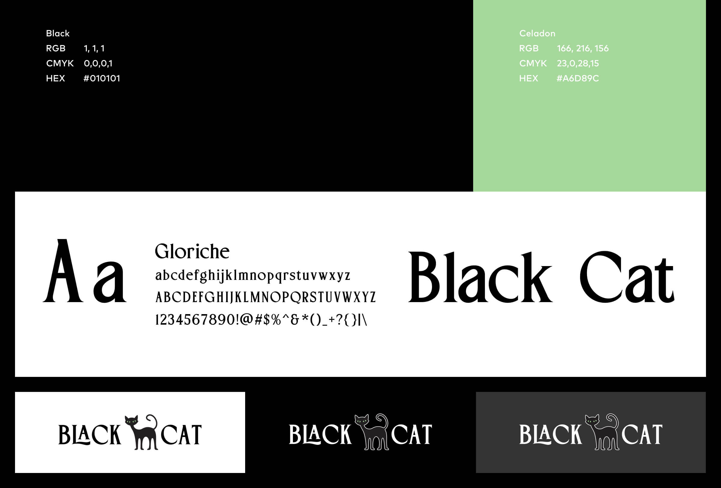
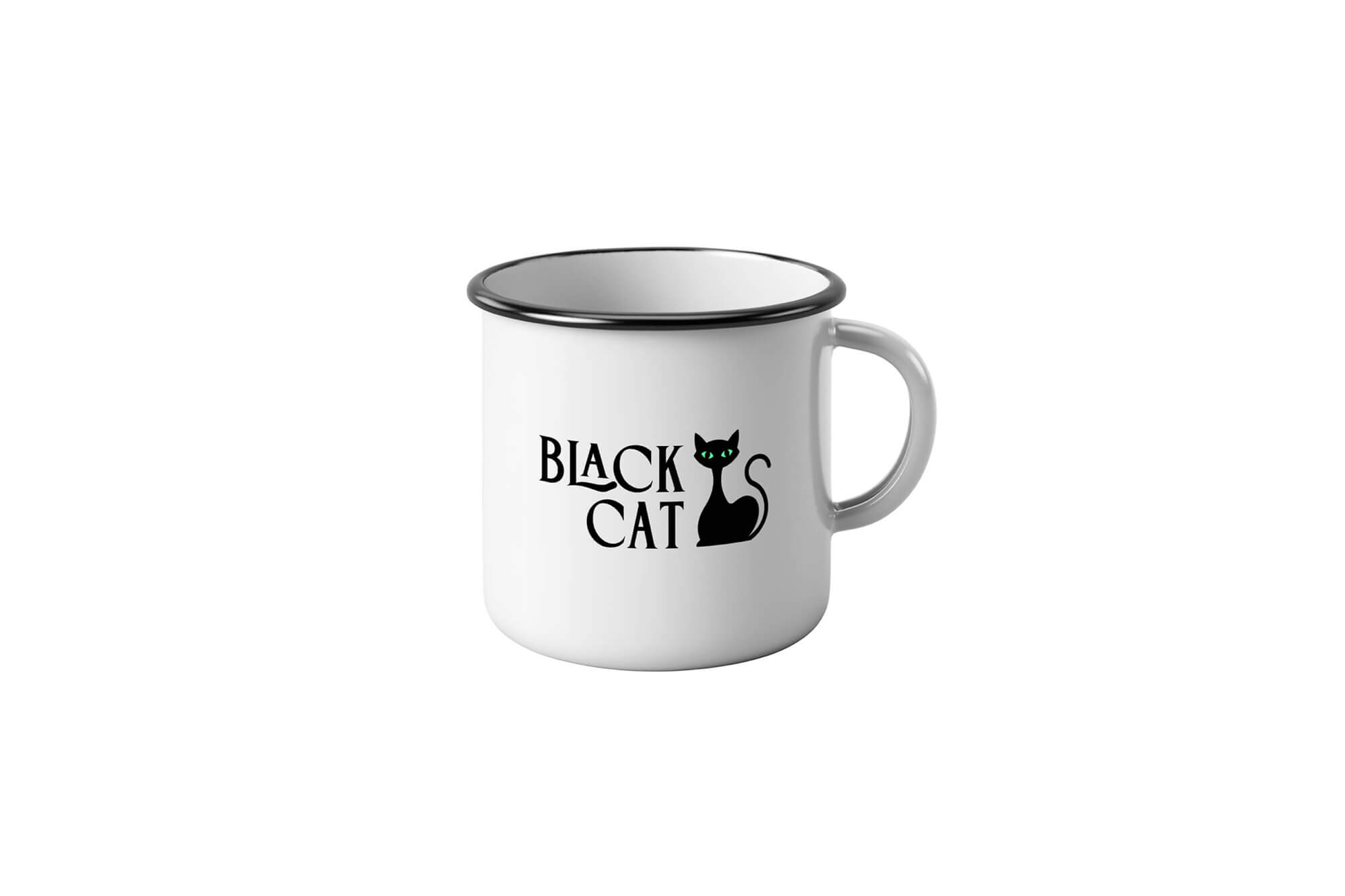
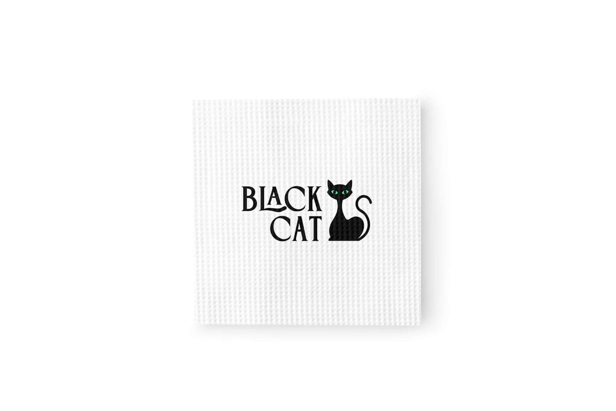
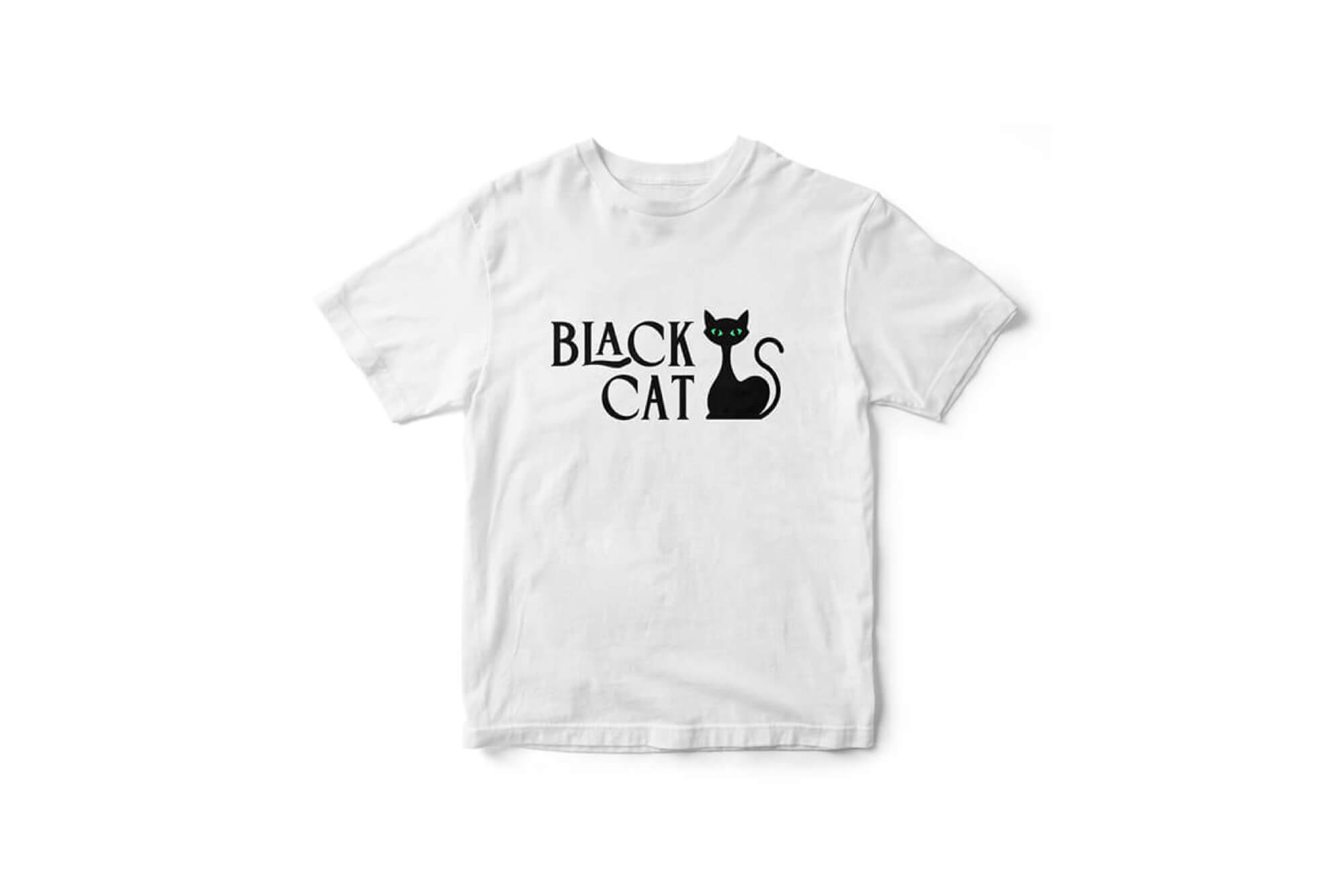
[Black Cat // Cobourg, ON // Brand identity design]
The mission:
Nestled in the small town of Port Hope, Bualai – Taste of Thai sits quietly on an unassuming downtown corner. Blink once going past and you’d miss it, there’s almost no indication there’s an amazing Thai food restaurant in this community of just under 17,000. Once inside the front doors though, you’re instantly transported into a monumental and culinary tribute to the owner’s cultural past. Unconventional self-promotion and seemingly old-school defiance to fully embrace modern technology almost lends to the charisma and underdog support this eatery exudes.
The challenges:
Simply put: There is absolutely nothing to critique about Bualai’s food at all. It’s authentic Thai food, expertly and beautifully crafted by its owner and staff. Everything’s as fresh as you’d expect in a Bangkok street market but without the rush or bustle to get it. However, for all its greatness when it comes to its food, the branding for Bualai falls flat for what you’d expect from a palatable genius. The good news is any upgrade in branding would be a huge improvement to properly pay homage to the food. Not just any branding though, but a well-crafted style and colour that matches the artistic and playfulness of Bualai’s dishes.
The solution:
Bualai’s current branding features a wordmark in a pseudo-Art Deco typeface (Plaza SH Regular Alt), which lends nothing to the warm, fuzzy feeling you get when you think of Thai food. For the new lettering (done in a vivid ruby pink gradient), I styled it after the typeface Roundlane but curved the edges of the letters in “Bualai” as a nod to the knives and utensils in a kitchen. I then paired the typeface Nexa Slab, in a deep purple tone, as a great visual compliment for the slogan “Taste of Thai”. Crowning the lettering is a vibrant Lotus flower with hues of purple covering its leaves and Lotus mandalas anchoring the slogan.
The result is a fresh, clean and modern logo & branding for Bualai, which was desperately needed to pair with their amazing food. The colours roar fun and glamourous and sophisticated typefaces exude a quiet yet bold confidence for the restaurant’s image. Bualai has a long way to go to fully complete its modernization (like a dedicated website, online ordering and visual advertising across multiple platforms) but this logo is a good start to freshen up a product that, unlike their food, was completely stale.