Toronto has a lot of law firms, both big and small, but Morris Kepes Winters LLP stands out in their specific legal niche approach. A boutique firm specializing in U.S. and Canadian tax law, MKW has carved out a great reputation serving North American and international clients.
The challenges:
While MKW certainly didn’t have branding which considered unsuitable, it needed a refresh in terms of softening it up for its boutique image. Their logo needed a bit of tightening up too, it needed to be more sleek and compact. Part of the challenge was to make a logo and branding polished without making it look boring or too corporate. Corporate branding can still have personality, that’s what the goal was in the refresh.
The solution:
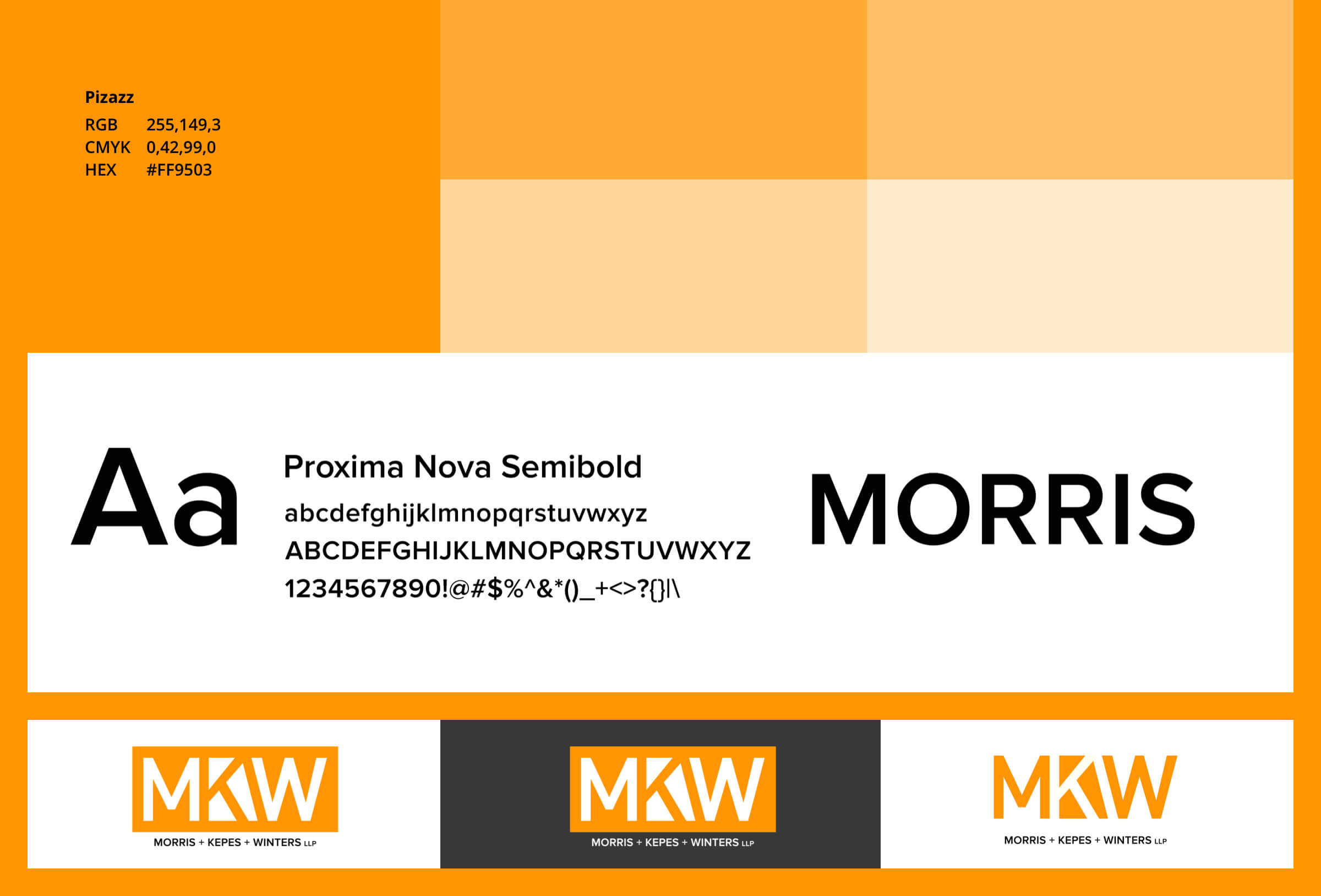
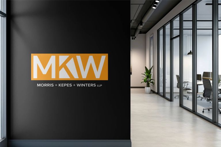
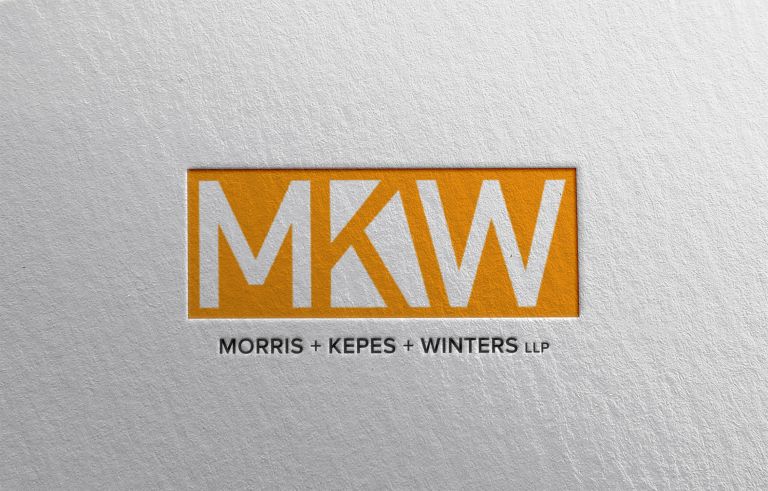
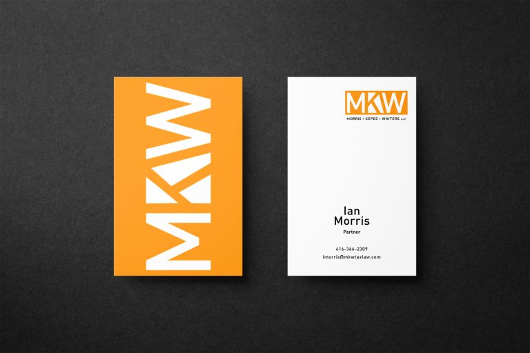
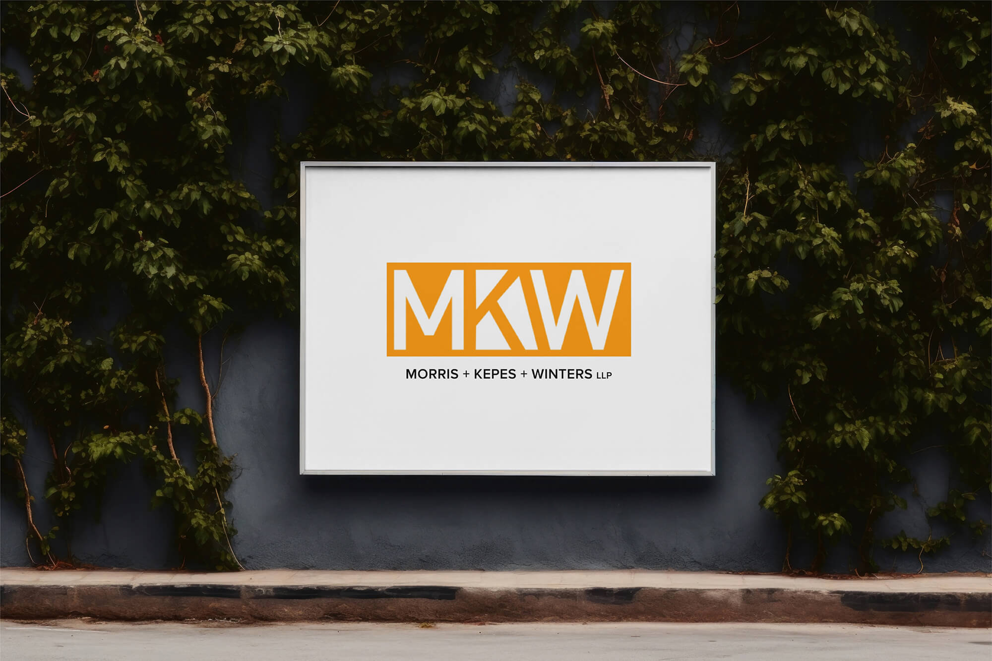
MKW used orange as their brand colour and it was a great choice. In the brand refresh, I stuck with orange but softened up considerably (from Crayon Orange to Pizazz Orange). For the logo, I changed the font (Proxima Nova, all uppercase) for the lettering and used negative space for the letters “MKW” to be joined together. This creates both a harmonious tone and adds a bit of creative flare to it.
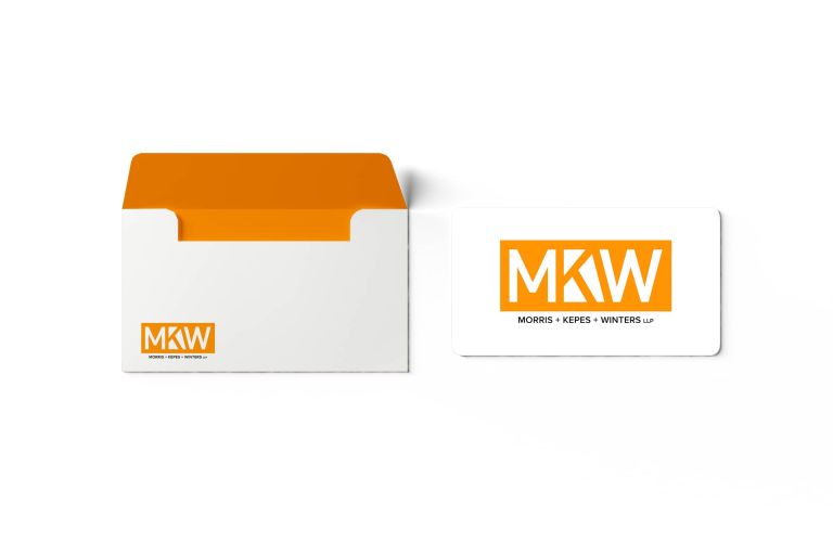
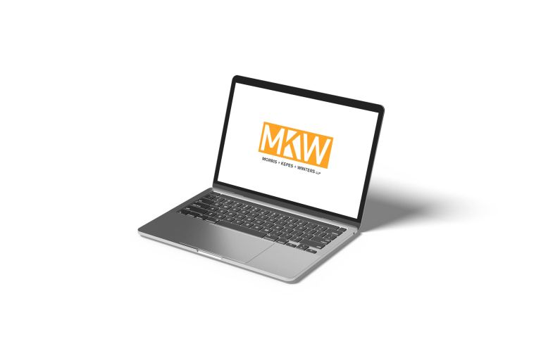
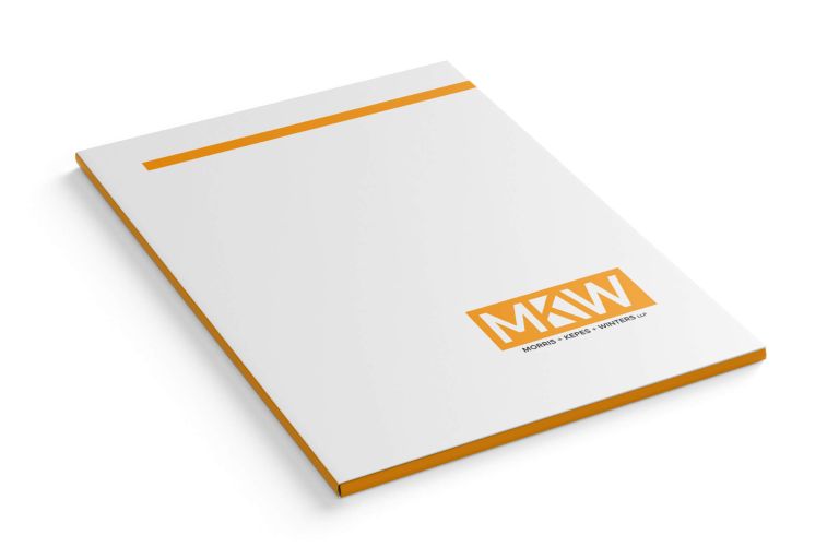
The result is a more sleek and bold logo without sacrificing sophistication. Orange is a tricky colour to not look completely overwhelming or even wash out things around it but with this particular hue, it works well on any background. With this refresh, the MKW logo now conveys enthusiasm and trust, which is exactly what you want for a law firm.